The dashboard most enterprise SEO teams use was built by the person who left two roles ago. Nobody has opened it in three weeks. Nobody trusts the numbers on it. Nobody can name what would change in the work tomorrow if a green line went red. This is the SEO dashboard problem, and it is endemic enough that solving it is a competitive advantage that costs almost nothing to ship.
The fix is not a better tool. It is a tighter answer to a question most teams never asked the dashboard to answer: what decision is this view supposed to inform, and who is supposed to make it. A dashboard that fails that test ends up tracking everything and changing nothing.
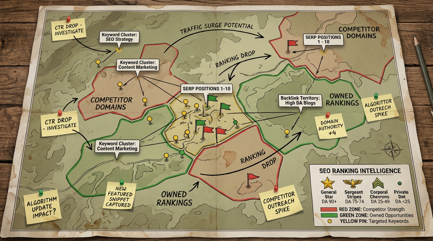
The bar a dashboard has to clear
Avinash Kaushik framed the question almost twenty years ago and the framing has not aged. "Can I take action against the data being reported?" If the answer is no, the metric does not belong in the report. He grouped what teams measure into three buckets, efficiency, effectiveness, and vanity, and most SEO dashboards are mostly the third one. Sessions, impressions, average position, page count, all of it visible, none of it changing what anyone does on Monday morning.
The bar a working SEO dashboard has to clear is much narrower than the surface area most dashboards try to cover. It has to make a small number of decisions easier, and it has to make the right person make them. For an enterprise SEO leader, those decisions usually come down to four: where to invest next, what to defend, what to deprioritise, and what to surface to leadership before they ask. Anything that does not feed one of those four does not earn a panel.
The shift in framing is what produces the second test, and it is the one most teams miss. The dashboard is not for everyone. A panel that helps the SEO lead does not necessarily help the CMO, and a panel that the CMO wants to see does not necessarily help the practitioner. A useful dashboard either picks a single reader, or it stacks the views so the practitioner reads the lower half and the executive reads the top half. The combined-audience dashboard is the most common failure mode in enterprise SEO programs we audit, and the symptom is always the same: too many tabs, no clear owner, no consistent action.
Four panels, not forty metrics
A useful SEO dashboard tends to converge on the same four panels regardless of vertical. Forty-metric dashboards differ from each other in what filler they include; four-panel dashboards differ from each other in what their organisation actually values. The discipline is in the cut.
Sample SEO Dashboard, Acme Co
Panel 1
Demand capture vs available
Share of searches in the cluster that resolved to a top three Acme result. Weekly rolling, four week average.
Panel 2
Commercial impact of organic
| Category | Rev share | YoY |
|---|---|---|
| Running shoes | 34% | +9 pp |
| Trail shoes | 28% | +4 pp |
| Apparel | 17% | flat |
| Accessories | 12% | -3 pp |
| Outlet | 9% | -6 pp |
Organic-attributed revenue as a share of total category revenue, rolling 28 days vs same period last year.
Panel 3
What the team shipped
Effort-weighted. Hover any tile in the live build for the ticket list behind the number.
Panel 4
Anomalies this week
Trail cluster: AI Overview shifted to REI
Six of nine tracked queries lost the citation slot we held since Feb. Impressions stable, clicks down 18%.
Owner: Lena. Action: refresh top-of-page summary, add 2026 buying guide schema.
404 spike on /collections/sale/* (+340 URLs)
Outlet campaign retired old slugs without redirects. Search Console caught Friday, logs caught Monday morning.
Owner: Dev. Action: 301 batch shipped, monitor next crawl.
New competitor in marathon plans cluster
Domain entered top 10 for 14 of 28 tracked queries in 9 days. Pattern looks programmatic.
Owner: Strategy. Action: teardown booked for Thursday.
GPTBot share of crawl up to 11% (from 6%)
No latency impact at origin. Worth watching as a leading citation signal.
Owner: monitoring only.
A working example of the shape, with realistic numbers for a multi-category ecommerce brand. The four panels explain why each one is there.
The first panel reports demand capture against demand available. Not impressions, not clicks in isolation. The metric is the share of the searches you could have shown for that you actually showed for, segmented by the page or cluster that owns the topic. Impressions go up because demand went up; share of available demand goes up because the work moved the page. The number is harder to compute and almost always less flattering than the raw chart in Search Console, and that is the point. It tells the team where the work is winning the available market and where it is leaking it.
The second panel reports the commercial impact of organic, not its volume. For ecommerce, the number is organic revenue as a percentage of total revenue, by category, against last year. For B2B, it is organic-sourced pipeline value, by intent stage. For media, it is organic sessions that hit a defined conversion event, not the homepage. The point of the panel is that any change in the number has to be explainable in business terms, not in SEO terms. A seven percent uplift in organic revenue from middle-funnel content is a budget conversation. A seven percent uplift in average position is not.
The third panel reports the work the team is doing, not just the results. Pages published, pages refreshed, technical issues closed, schema deployed, internal links rebalanced, weighted by the effort each one cost. Without this panel, the dashboard cannot answer the most basic question leadership asks during quarterly reviews: what did you ship, and what did it move. With it, every metric in the other panels has an obvious counterfactual sitting next to it.
The fourth panel reports anomalies, not levels. A spike in 404s, a sudden drop on a specific page cluster, a competitor surge in a category you own, a sudden citation pattern shift in AI engines. Anomalies are what dashboards exist to surface; levels are what spreadsheets are for. If the dashboard cannot tell you something you did not already know, it is not a dashboard, it is a screensaver.
What does not belong on the dashboard
Most of the cleanup work is deletion. Average position averaged across the whole site is the canonical example of a metric that looks like signal and acts like noise; it moves for reasons unrelated to anything anyone is doing, and the only honest read is per cluster, per query class, with the variance shown next to the average. Page-level impressions divorced from intent and SERP feature context are similarly misleading; impressions on a page that lost its featured snippet to AI Overviews are not the same kind of impression as those on a page that earned a Top Stories slot.
Domain Rating and Domain Authority belong off the dashboard for any leader who has been burned by them. They are model outputs from third-party tools, useful for competitor research, never the right number to brief a CFO with. The same applies to share of voice scores computed across a keyword universe nobody pressure-tested; the input list ages faster than the score does, and the trend line stops meaning what it appeared to mean.
Anything that updates daily and is read weekly should not update daily. The cadence has to match the decision. A panel refreshed every hour invites teams to overreact to noise that will smooth out by Friday. The right cadence for most SEO panels is weekly aggregated against a rolling window, with the daily view available on click.
A weekly read, not a daily glance
A dashboard people open every day is usually a dashboard people no longer act on. The dashboards we see drive real change are read weekly, in a meeting, by a named owner, with a written action attached to every panel that moved beyond its expected band. This is the operational discipline most SEO programs underrate. Tools do not produce decisions; rituals do.
The simplest ritual is a 30 minute Monday meeting where the SEO lead walks through the four panels and names one change in the work for the week based on what the panels show. If the panels do not produce a change in the work, the meeting ends in five minutes and the dashboard goes back on the shelf until next Monday. Both outcomes are useful. What the dashboard should never become is a passive feed people glance at between other tasks, because that is how organisations end up paying for visibility into data nobody is actually using.
The infrastructure decision underneath
The data spine matters more than the front end and almost nobody decides on it deliberately. For any SEO program past a small site, Search Console's UI exports are not the source of truth; they cap at 1,000 rows per query and a 16 month window. The serious move is enabling Search Console's bulk data export to BigQuery, which Google documents in detail and which removes both the row cap and the data retention horizon. The dashboard then sits on top of the warehouse, not on top of the API. The change does not look dramatic until the first time someone asks a question that the UI cannot answer, which on a 100,000 page site happens in week one.
The same logic applies to GA4, rank tracking, log files, and the AI citation signal layer that is now joining the stack. Each source belongs in the warehouse on a schedule, joined on URL and date, before any panel is built on top. Building dashboards directly on top of disconnected APIs feels faster early and gets slower every quarter. Treat the warehouse as the product, and the dashboard as a thin view on top of it. The reverse pattern, dashboard as product and warehouse as afterthought, is what produces the inherited dashboard nobody trusts.
Aleyda Solís' Google update analysis Looker Studio template is a useful proof of concept for what a single panel can do when it is designed around a single question instead of a category of data. It does one thing, it does it well, it tells the reader something they did not already know. That is the bar a serious SEO dashboard has to clear before anyone bothers building it.
If your current dashboard cannot answer "what should we do differently this week" in under five minutes, it is not a measurement problem you have, it is a design problem. The measurement industry sold dashboards as the deliverable. The deliverable was always supposed to be the decisions the dashboard produces. Rebuilding a dashboard against that one criterion is one of the highest-leverage two-week projects an enterprise SEO team can run, and it is the foundation the rest of the program either earns or loses its budget on. We run this discipline inside our measurement engagements at Search Agency, where dashboards are scoped to the decisions they exist to inform, not to the metrics that happen to be available.
See where your brand stands in AI answers today, benchmarked against your competitors, no pitch required.

75% of What AI Mode Cites in Travel Is Guide Content
Google AI Mode cites about 26 sources to answer a single travel query, and three quarters of them are the guides, tips and itineraries most teams are cutting. Our 100-query study on what it pulls, who gets cited, and why the click drop isn't a content-quality drop.
read_post →
Total Graph Authority, How Brands Get Cited by AI
AI answers change run to run, so being cited once proves little. Total Graph Authority lines up first-party, third-party, and social so you stay in the answer, with examples you can copy.
read_post →
Who Google AI Mode actually cites when Indonesians ask about banking
We ran 72 Indonesian banking and finance prompts through Google AI Mode, 216 answers in all, and logged every source it cited. Banks dominate, comparison sites and Instagram punch above their weight, and regulators barely show up.
read_post →